Knowledge Base Docs
Data in Publishing
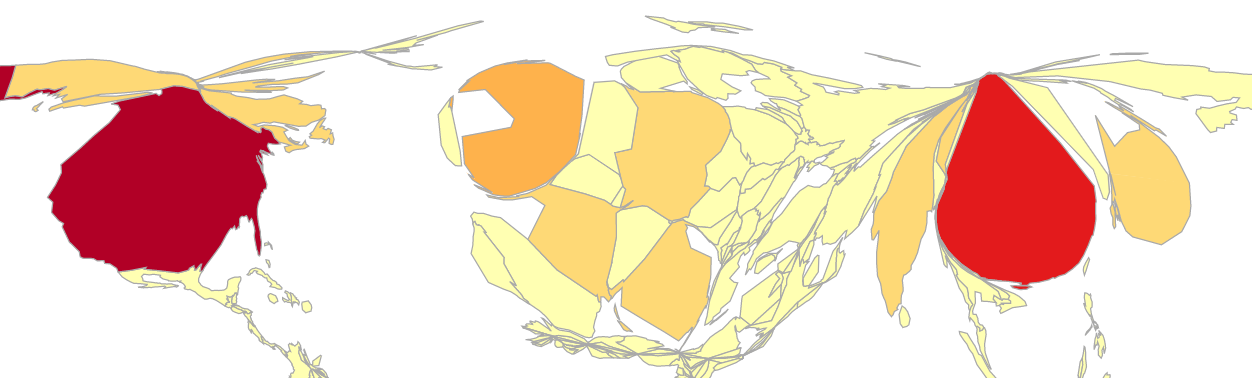
Unique Cartogram Using Number of Documents Published
This cartogram created by Juan Pablo Alperin and Rodrigo Costas is a virtual map that visualizes publications proportional by count, as a proportion of GDP, and as a proportion of population. The map uses publication data from Scopus and population and GDP data from the World Bank. The number of U.S. publications shrinks greatly once per capita and GDP are layered. Because the cartogram is powered by d3.js, you can interact with the map by selecting a year (1997, 2007, 2017) and hovering over each country to discover the exact counts. Try it out today!
Difficulty in Tracking Open Research Datasets
A recent article written by Lizzie Gadd & Gareth Cole of Loughborough University in the U.K. covers the issues measuring open research data, which include the following challenges:
- Equivalence: Lack of standardization of what qualifies as a single unit of data
- Source: Tracking down the various locations of the data repositories
- Authorship: No assurance that all of the data creators are associated to the metadata record
- Quality assurance: No peer review process